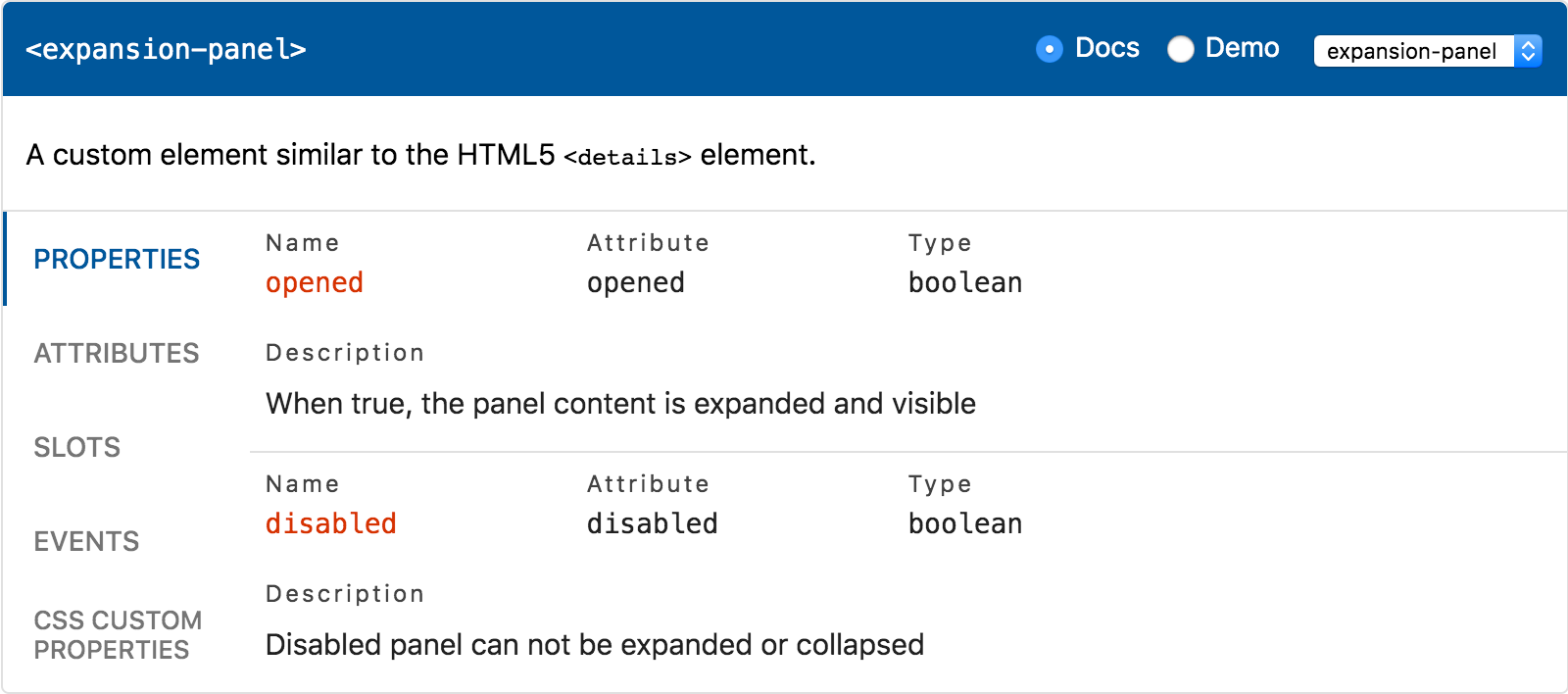
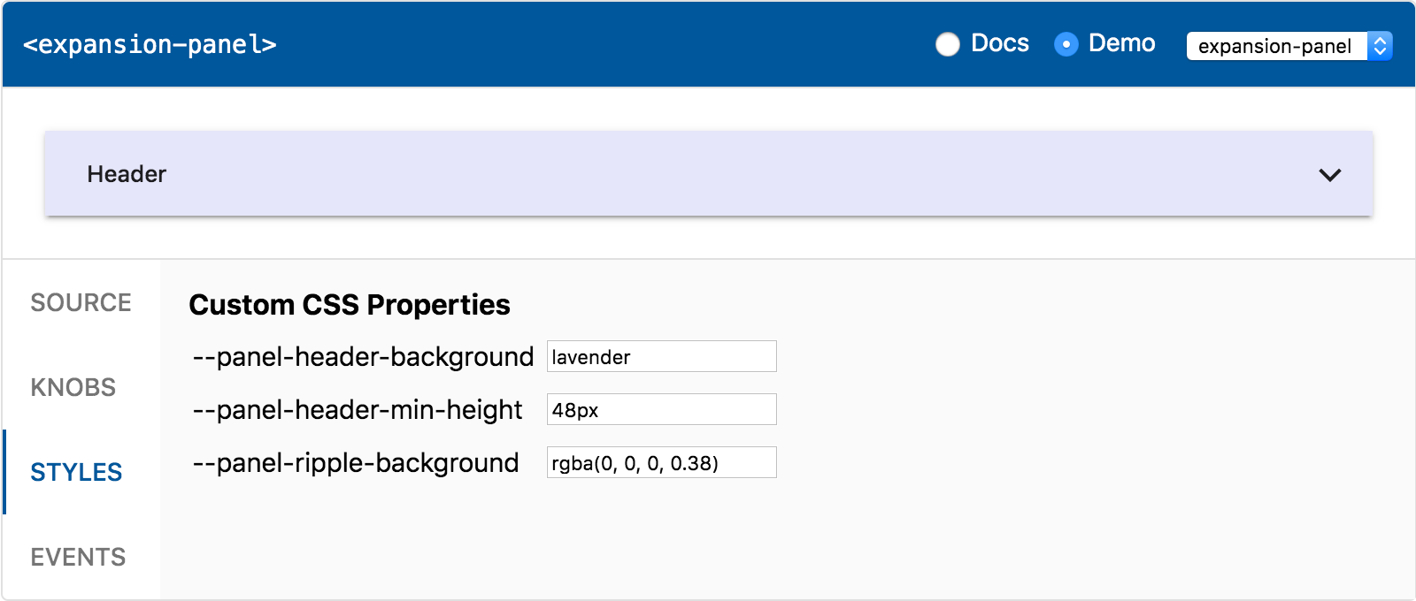
API documentation and live playground for Web Components. Based on custom elements manifest JSON format.
<api-viewer src="./custom-elements.json"></api-viewer>- API docs viewer
- Properties - JS properties publicly exposed by the component
- Attributes - HTML attributes (except those that match properties)
- Events - DOM events dispatched by the component
- Slots - default
<slot>and / or named slots, if any - CSS Custom Properties - styling API of the component
- CSS Shadow Parts - elements that can be styled using
::part
- Live playground
- Source - code snippet matching the rendered component
- Knobs - change properties and slotted content dynamically
- Styles - change values of the custom CSS properties
- Event log - output the events fired by the component
- Templates - configure complex slotted content
$ npm install api-viewer-elementOr grab from unpkg.com CDN:
<script src="https://unpkg.com/api-viewer-element?module" type="module"></script>- Install custom elements manifest analyzer:
$ npm install @custom-elements-manifest/analyzer- Analyze your components:
$ cem analyze my-element.jsRead the docs for more information on how to use the analyzer.
- Create an HTML file and import the component:
<!DOCTYPE html>
<html>
  <head>
    <script type="module">
      import 'api-viewer-element';
    </script>
  </head>

  <body>
    <api-viewer src="./custom-elements.json"></api-viewer>
  </body>
</html>- Use web-dev-server to serve your HTML page.
Starting from 0.4.0 release, the following components are available:
A custom element that provides both API docs and live playground.
import 'api-viewer-element';A custom element that only provides API docs (no live playground).
import 'api-viewer-element/lib/api-docs.js';A custom element that only provides live playground (no API docs).
import 'api-viewer-element/lib/api-demo.js';Import the components documented in JSON file to enable demos:
<script type="module">
  import 'my-element';
</script>
<api-viewer src="./custom-elements.json"></api-viewer>
In order to ensure that all the playground features work properly and knobs for properties and CSS custom properties are in sync, please read the following sections and update the code of your custom elements accordingly if needed.
The playground listens to all the events dispatched by the rendered component. This can be used to
sync knobs with the property changes caused by the user. In order to make it work, dispatch and
document [property]-changed events:
/**
 * A custom element that fires event on value change.
 *
 * @element my-element
 *
 * @prop {String} value - Value of the component
 * @fires value-changed - Event fired when value is changed
*/The playground collects the default values for the documented CSS custom properties on the
rendered component using getComputedStyle(element).getPropertyValue(). In order to make it work,
use the following CSS structure:
:host {
  --button-color: red;
}

button {
  color: var(--button-color);
}The following properties can be set on the <api-viewer> element:
Use section property to toggle between demo and API docs:
<api-viewer src="./custom-elements.json" section="demo"></api-viewer>Use selected property to configure the displayed element:
<api-viewer src="./custom-elements.json" selected="my-element"></api-viewer>Use exclude-knobs attribute to exclude properties from demo:
<api-viewer src="./custom-elements.json" exclude-knobs="autofocus,items"></api-viewer>Use manifest property instead of src to pass manifest data directly:
<api-viewer></api-viewer>
<script>
  fetch('./custom-elements.json')
    .then(res => res.json())
    .then(manifest => {
      document.querySelector('api-viewer').manifest = manifest;
    });
</script>Use setTemplates method to override <template> elements:
// gather the template elements placed in the DOM
const templates = document.querySelectorAll('template[data-target]');

// configure the api-viewer to use the templates
document.querySelector('api-viewer').setTemplates(templates);Note: the method is available on api-viewer and api-demo elements only. Corresponding base
classes do not have it. When extending a base class, you have to re-implement it yourself if you
need to preserve the existing behavior.
The following templates can be passed to <api-viewer> element:
Use "host" template to configure property values:
<api-viewer src="./custom-elements.json">
  <template data-element="progress-bar" data-target="host">
    <progress-bar max="100" min="1" value="50"></progress-bar>
  </template>
</api-viewer>Use "slot" template to configure complex content:
<api-viewer src="./custom-elements.json">
  <template data-element="fancy-accordion" data-target="slot">
    <expansion-panel>
      <div slot="header">Panel 1</div>
      <div>Content 1</div>
    </expansion-panel>
    <expansion-panel>
      <div slot="header">Panel 2</div>
      <div>Content 2</div>
    </expansion-panel>
  </template>
</api-viewer>Note: do not minify HTML to keep proper indentation.
The following custom CSS properties are available:
| Property | Description |
|---|---|
--ave-accent-color |
Accent color, used for property names |
--ave-border-color |
Color used for borders and dividers |
--ave-border-radius |
Border radius used for the outer border |
--ave-button-active-background |
Color of the :focus and :hover button |
--ave-button-background |
Background of the button (code snippet, events) |
--ave-button-color |
Color of the button (code snippet, events) |
--ave-header-color |
Header text color used for tag name |
--ave-item-color |
API items content color (main text) |
--ave-label-color |
API items labels color |
--ave-link-color |
API description links default color |
--ave-link-hover-color |
API description links hover color |
--ave-monospace-font |
Monospace font stack for the API items |
--ave-primary-color |
Primary color, used for header and active tab |
--ave-tab-color |
Inactive tabs color |
--ave-tab-indicator-size |
Size of the selected tab indicator |
The following CSS shadow parts are available:
| Part | Description |
|---|---|
header |
Header containing element name and navigation controls |
header-title |
Title element placed in the header (element tag name) |
tab |
<api-viewer-tab> component used in docs and demo |
tab-panel |
<api-viewer-panel> component used in docs and demo |
warning |
Message shown when no elements or API docs are found |
| Part | Description |
|---|---|
docs-description |
Custom element description |
docs-column |
Column, child of a docs-row part |
docs-item |
Item representing a single entry (property, event etc) |
docs-label |
Label (name, attribute, type, description) |
docs-markdown |
Iem description with parsed markdown content |
docs-row |
Row containing columns. Child of a docs-item part |
docs-value |
Sibling of a docs-label part (name, attribute, type) |
md-h1 |
Markdown <h1> elements |
md-h2 |
Markdown <h2> elements |
md-h3 |
Markdown <h3> elements |
md-h4 |
Markdown <h4> elements |
md-h5 |
Markdown <h5> elements |
md-h6 |
Markdown <h6> elements |
md-a |
Markdown <a> elements |
md-p |
Markdown <p> elements |
md-ul |
Markdown <ul> elements |
md-ol |
Markdown <ol> elements |
md-li |
Markdown <li> elements |
md-pre |
Markdown <pre> elements |
md-code |
Markdown <code> elements |
md-strong |
Markdown <strong> elements |
md-em |
Markdown <em> elements |
md-blockquote |
Markdown <blockquote> elements |
md-del |
Markdown <del> elements |
| Part | Description |
|---|---|
demo-output |
Wrapper of the rendered component in the live demo |
demo-snippet |
Wrapper of the code snippet in the live demo |
demo-tabs |
Tabs component used to switch panels in the live demo |
event-log |
Wrapper of the event log tab content |
event-record |
<p> used as a record in the event log |
knobs |
Wrapper of in the properties / styles knobs panel |
knobs-column |
Column in the properties / styles knobs panel |
knobs-header |
Header of the properties / styles knobs column |
knob-label |
Label associated with an input in the knobs panel |
| Part | Description |
|---|---|
button |
<button> used to copy code / clear events log |
checkbox |
<input type="checkbox"> used by boolean knobs |
input |
<input type="text"> used by knobs |
radio-button |
<input type="radio"> used to toggle docs / demo |
radio-label |
<label> associated with the radio button element |
select |
<select> used to choose displayed component |
select-label |
<label> associated with the select element |
Read more about using ::part() at MDN Web Docs.
npm installnpm run devnpm run distnpm run serve:dist- Big thanks to @runem for creating Web Component Analyzer, which previous versions of this package were based on.
- Thanks to @bahrus for wc-info component which inspired me.
- The visual appearance is largely inspired by Vuetify API docs.
- The tabs component is based on the howto-tabs example.
- Thanks to Modern Web for Web Dev Server and Rollup Plugin HTML.

