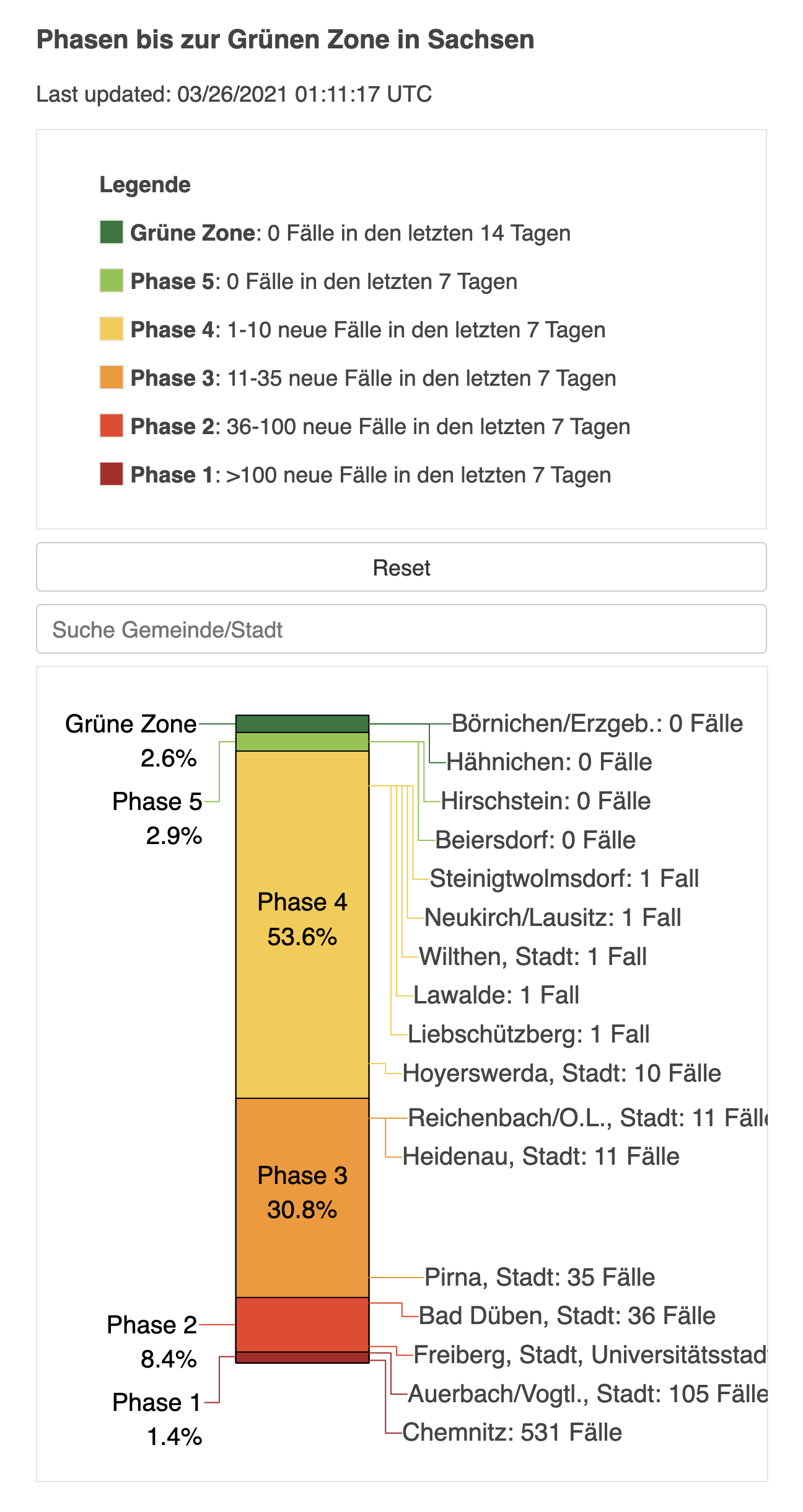
This application integrates with Endcoronavirus.org's Green-zone rankings calculations, such as that in this repository, and generates a visualization of any region's progress in eliminating COVID-19.
- Pipeline is available for monitoring at https://concourse.nocovid.group
- Visualizations are served at https://nocovid.group/{region}
- In a rankings repository, create a
visualizationsfolder with the following file structure. See the example for reference.. ├── ... ├── visualizations │ ├── values.yaml # Values for Helm deployment │ ├── config # Per-region configuration files │ │ ├── region │ │ │ └── subregion.yml │ │ ├── region.yml │ │ └── ... │ ├── last-updated # Per-region last-updated timestamp files │ │ ├── region │ │ │ └── subregion.log │ │ ├── region.log │ │ └── ... │ └── pickles # Per-region pickle files │ │ ├── region │ │ │ └── subregion.pkl │ ├── region.pkl │ └── ... └── ...
NOTE: Naming
Hyphens are allowed in region paths & filenames! However, spaces and other special characters are not; please replace them with underscores.
- Modify your regions' ranking.py files to generate .pkl and last-updated files
- Pickle File
- Required columns are region name, category, time safe, and primary incidence (e.g. cases in 7 days)
- Optional columns are postcode, secondary incidence (e.g. cases per 100k in 14 days), and percent change (use if primary and secondary incidence are of the same unit and measured over different periods of time)
- The .pkl file should be saved to
visualizations/pickles/{region}.yml
- Last Updated File
- Each time a new .pkl file is created, save the date and time to
visualizations/last-updated/{region}.log - Any format and time zone can be used
- Each time a new .pkl file is created, save the date and time to
# Save pickle and last updated time for visualizations
# Define filepaths
region_path = "germany/brandenburg/uckermark"
vis_path = "visualizations"
pickle_file = f"{vis_path}/pickles/{region_path}.pkl"
last_updated_file = f"{vis_path}/last-updated/{region_path}.log"
# Ensure directories
os.makedirs(os.path.dirname(pickle_file), exist_ok=True)
os.makedirs(os.path.dirname(last_updated_file), exist_ok=True)
# Write files
df.to_pickle(pickle_file)
with open(last_updated_file, 'w') as file:
    file.write(datetime.utcnow().strftime("%m/%d/%Y %H:%M:%S UTC"))
- Pickle File
- Create a configuration .yml file for each region in the
visualizations/configfolder- Documentation of all configuration options is available in visualizations/layout.py
- Make sure the required configuration options are set!
- Default values for non-required options can be seen at the top of the file
- For examples, refer to sample.yml or the config files here
- The file extension must be .yml, not .yaml
- Documentation of all configuration options is available in visualizations/layout.py
- Copy the example values.yaml into your visualizations folder and configure it according to the documentation.
- If the deployment pipeline is not yet configured to pull from your repository, you can implement it here and submit a pull request. Or, you can ask Jason to do it.
NOTE: Subregions
As you can tell above, subregions are represented in a hierarchical fashion. Hence, when working with a
subregion's path, be sure to always prepend it with its parent region(s). In other words, you cannot refer to it
as {subregion}, only as {region}/{subregion} (e.g. germany/saxony and not saxony). For example, the pickle file
for region sample/subsample should be saved to visualizations/pickles/sample/subsample.pkl. This needs to
be done correctly for a proper URL structure!
- To modify a region's visualization, you just need to modify the region's config file (or the .pkl generation) and changes will automatically be applied
- To translate a region, use the title and string configuration options. Consult the config files here for reference.
- Install Docker and Docker Compose.
- Copy the example docker-compose.yml and .env files in the into the directory that contains your
visualizationsfolder - Configure
docker-compose.yml, replacing all references tosamplewith your region, e.g.germany- You can copy and paste the
sample-visualizationtemplate to test multiple regions simultaneously
  sample-visualization:
    image: registry.nocovid.group/visualizations:latest
    restart: on-failure
    environment:
      - REGION=sample
      - BOKEH_ALLOW_WS_ORIGIN=localhost,${SERVER_HOST},${GLOBAL_WHITELIST}
      - REPOSITORY_PATH=${REPOSITORY_PATH}
      - DOWNLOAD=${DOWNLOAD}
      - BOKEH_SSL_CERTFILE=${SSL_CERTFILE}
      - BOKEH_SSL_KEYFILE=${SSL_KEYFILE}
    volumes:
      - ./visualizations:/visualizations/data
    ports:
      - ${SAMPLE_PORT}:5006
- You can copy and paste the
- Add an environment variable for your region's port in the .env with an unused port, e.g.
AUSTRALIA_PORT=5008 - Clone this repository and run
docker build . -t registry.nocovid.group/visualizations:latestin the root folder. - Run
docker-compose upin the root folder of the repository, and once the server is up, go tohttp://localhost:((port))/((region)), replacing ((port)) with the port you used in step 4 and ((region)) with the region name. - Every time you want to reload your changes, stop the previous containers and re-run
docker-compose up
- If you are using the default sizing and font configuration, this HTML and CSS is a good starting point to embed the visualizations.
<iframe class="vis-embed" src="https://nocovid.group/saxony/visualizations"></iframe>
<style>
.vis-embed {
    display: block;
    width: 600px;
    height: 1200px;
    margin: auto;
}
@media (min-width: 768px) {
    .vis-embed {
        width: 700px;
        height: 1300px;
    }
}
</style>- All deployments should be handled by the CI/CD pipeline. To set up pipelines or infrastructure, see here.
